
Best ChatGPT Fonts for Readability, Accessibility, and Long Sessions
Custom Fonts vs. Default Fonts in ChatGPT
When using ChatGPT, the choice between default and custom fonts can significantly impact your reading experience. Default fonts like Segoe UI, San Francisco, and Roboto are designed for compatibility and consistent readability across devices. They’re reliable, but lack personalization and advanced accessibility features.
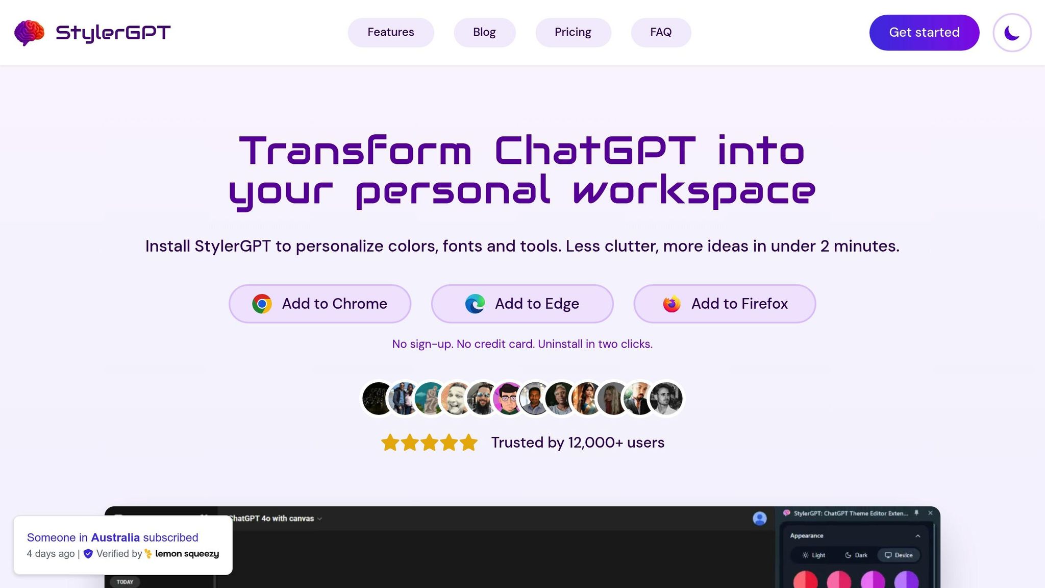
Custom fonts, on the other hand, offer flexibility to suit individual preferences or specific needs, such as fonts for dyslexia or improved spacing for readability. Tools like StylerGPT simplify font customization, allowing you to choose from 1,000+ Google Fonts, adjust sizes, and even enhance the interface with themes and productivity features.
Key Points:
- Default Fonts: Reliable, consistent, and optimized for cross-platform use but limited in personalization.
- Custom Fonts: Allow for personalization and accessibility improvements but may face compatibility or performance issues.
- StylerGPT: A browser extension offering easy font customization, themes, and productivity tools for ChatGPT users.
Quick Comparison:
| Feature | Default Fonts | Custom Fonts |
|---|---|---|
| Readability | High | Variable |
| Compatibility | High | May vary |
| Personalization | None | High |
| Accessibility Options | Basic | Expanded |
| Load Speed | Fast | May slow slightly |
If you value stability, default fonts are a solid choice. For a more tailored experience, custom fonts with tools like StylerGPT can enhance comfort and usability.
Default Fonts in ChatGPT: Features and Limitations
Taking a closer look at the default fonts in ChatGPT reveals how they shape the platform’s user experience while also uncovering areas where customization could improve usability. The default fonts strike a balance between functionality and simplicity, but they come with certain trade-offs. These system sans-serif typefaces form the visual backbone of the ChatGPT interface.
Main Features of Default Fonts
ChatGPT uses system-optimized fonts tailored to each operating system. For instance:
- Windows: Segoe UI
- Apple devices: San Francisco
- Android: Roboto
Additionally, the chat input field features Victor Mono, a monospaced font that distinguishes user input from AI-generated responses.
These fonts are chosen for their clean, modern design, ensuring readability and a consistent look across devices - whether it’s a smartphone, tablet, or desktop. This consistency helps maintain focus on the content, a key priority for the platform.
Why ChatGPT Uses These Default Fonts
The decision to use system fonts stems from a focus on compatibility and seamless functionality. By relying on fonts already installed on users’ devices, ChatGPT avoids potential rendering issues and ensures a smooth, uniform experience across various platforms. This approach keeps distractions to a minimum, allowing users to concentrate on the AI’s responses.
Drawbacks of Default Fonts
While the default fonts succeed in delivering reliability and consistency, they do come with some limitations. A key issue is the lack of personalization - users are restricted to the fonts supported by their operating systems, leaving no room for individual style or branding preferences.
Accessibility is another concern. The default setup doesn’t cater to users with specific needs, such as larger text sizes, higher contrast, or fonts designed for conditions like dyslexia. This can make extended use of the platform uncomfortable for some.
Finally, while the minimalist design helps reduce distractions, it can feel impersonal to users who prefer a more customized workspace. Here’s a quick breakdown of these limitations and some potential fixes:
| Limitation | Impact on Users | Potential Solutions |
|---|---|---|
| No font size adjustment | Harder to read for some users | Use browser zoom or tools like StylerGPT |
| Fixed font family | No room for personalization | Apply custom CSS or browser extensions |
| Limited contrast options | Can cause eye strain | Adjust system-level accessibility settings |
For those seeking greater flexibility, tools like StylerGPT offer ways to tweak fonts and styles, enabling a more tailored experience. These workarounds highlight the need for more robust customization options in the future.
Custom Fonts in ChatGPT: Benefits and Challenges
Custom fonts give users the freedom to move beyond default settings, adding a personal touch to their ChatGPT interface. While this customization can enhance the user experience, it’s important to weigh both the advantages and potential drawbacks before diving in.
Benefits of Custom Fonts
One of the standout benefits is personalization. Unlike standard system fonts, custom fonts allow you to tailor the look and feel of ChatGPT to match your preferences. Whether you’re drawn to the sophistication of serif fonts for reading or prefer the simplicity of sans-serif styles, custom fonts let you shape your workspace to reflect your taste.
Accessibility options are another major advantage. For users with specific needs, such as dyslexia or visual impairments, custom fonts can make a world of difference. Fonts like OpenDyslexic, with weighted bottoms and distinctive character shapes, help reduce letter confusion. Similarly, fonts designed with generous spacing and clean letterforms can enhance readability for those who need it.
For businesses, brand consistency is a key reason to use custom fonts. If your company relies on a specific font across all its branding materials, you can extend that same visual identity to your ChatGPT workspace, creating a cohesive experience for both team members and clients.
Custom fonts can also help with reducing eye strain. Fonts optimized for screen reading, featuring better spacing and contrast, can make long ChatGPT sessions more comfortable and less tiring.
However, these advantages come with some challenges that users should be aware of.
Potential Issues with Custom Fonts
Compatibility problems are one of the most common hurdles. A font that looks perfect on your desktop might not display correctly on a mobile device or in a different browser. This can disrupt the consistency of your workflow and create unnecessary frustration.
Another concern is performance impact. Custom fonts, especially web fonts that need to be downloaded from external servers, can slow down page load times. Using multiple font styles or weights can further strain responsiveness, particularly for users with slower internet connections.
Readability issues can arise when design takes precedence over function. While decorative fonts might look appealing, they can hinder reading speed and comprehension if they’re hard to read.
Lastly, maintenance demands can be higher with custom fonts. Unlike default fonts that update automatically, custom fonts may require manual updates to fix issues or adapt to system changes.
Balancing these challenges with the benefits is key to creating a setup that works for you.
How to Enable Custom Fonts in ChatGPT
If you’re ready to explore custom fonts, there are a few ways to get started.
Browser extensions provide a simple solution. For instance, tools like StylerGPT give you access to 1,000+ Google Fonts through an easy-to-use side panel. This allows you to preview and switch fonts instantly, no coding required.
For those comfortable with more advanced methods, CSS customization is an option. By using browser developer tools or user stylesheets, you can override the default font settings and fine-tune aspects like size, weight, and spacing to your liking.
Another approach is font library integration. Services like Google Fonts and Adobe Fonts supply the necessary font files and CSS code. However, you’ll need to implement them correctly to avoid loading issues or licensing conflicts.
To use custom fonts, you’ll need a modern browser that supports CSS font-face declarations, a stable internet connection for loading web fonts, and either extension permissions or the ability to edit CSS, depending on your chosen method. With these tools in hand, you can customize your ChatGPT experience while keeping potential challenges in check.
Readability and User Experience: Default vs. Custom Fonts
Choosing between default and custom fonts in ChatGPT isn't just about aesthetics - it directly impacts how users read, process, and interact with AI-generated content. Understanding the differences can help you set up your ChatGPT workspace in a way that works best for your needs.
Readability and Accessibility Factors
ChatGPT’s default font choices prioritize universal accessibility. The platform relies on system fonts like San Francisco for Apple devices, Segoe UI for Windows, and Roboto for Android to ensure consistent readability across various platforms. These fonts offer a neutral and widely accessible reading experience.
However, accessibility needs differ widely among users. The Web Content Accessibility Guidelines (WCAG) provide specific recommendations for font choices. For example, WCAG advises a contrast ratio of at least 4.5:1 for standard text and 3:1 for larger text. Line height should be 1.5 times the font size, and letter spacing should be at least 0.12 times the font size.
Custom fonts can address gaps that default fonts might not fully cover. For instance, sans-serif fonts are easier to read, and specialized fonts like Lexend and Dyslexie are designed to enhance readability for people with dyslexia or other reading challenges.
Additionally, readability isn't just about visual impairments - factors like color contrast and spacing also play a big role. Custom fonts allow users to fine-tune these elements, providing tailored solutions for individual accessibility needs.
Font Preferences for US Users
When it comes to font choices, US users often have additional considerations tied to compliance and design standards. For example, ADA compliance is a key factor for many US-based organizations. Businesses using ChatGPT in customer-facing roles or internal workflows need fonts that meet specific accessibility requirements.
US design preferences also lean toward clean, professional typography. While fonts like Google’s Product Sans aim for a friendly vibe and Apple’s San Francisco emphasizes sleekness, ChatGPT’s default fonts focus on neutrality and broad accessibility.
Font size is another important factor. Many US users prefer body text sizes of 16px or larger, aligning with standard web design practices to ensure comfortable reading. However, personal preferences vary depending on factors like age, vision, and the type of device being used.
For US-based teams, cross-platform consistency is crucial. Given the mix of operating systems and devices in American workplaces, default fonts excel at delivering a uniform experience. Custom fonts, while offering more personalization, can sometimes lead to inconsistencies when team members use different systems.
Side-by-Side Comparison: Default vs. Custom Fonts
Here’s a quick breakdown of how default and custom fonts compare:
| Feature | Default Fonts (ChatGPT) | Custom Fonts (via extensions) |
|---|---|---|
| Readability | High | Variable |
| Compatibility | High | May vary |
| Personalization | None | High |
| Load Speed | Fast | May slow slightly |
| Accessibility | Basic | Expanded options |
| Distraction Risk | Minimal | Depends on selection |
Default fonts deliver consistently high readability across platforms, while custom fonts can range from excellent to poor based on how they’re implemented. Compatibility is another strength of default fonts, as they work seamlessly across devices and browsers. Custom fonts, on the other hand, might display inconsistently in certain environments, which could disrupt workflows.
When it comes to personalization, custom fonts take the lead. They allow users to adjust appearance, spacing, and style, creating a workspace tailored to their preferences. However, this flexibility comes with trade-offs, like potential delays in load speed when fonts need to be downloaded.
Accessibility is a key advantage of custom fonts. While default fonts provide a baseline level of accessibility, custom fonts can cater to specific needs, such as dyslexia-friendly designs or adjustable contrast and spacing.
Finally, distraction risk is worth considering. Simple, well-chosen custom fonts can enhance focus and comfort. But overly decorative options might hinder comprehension, so it’s important to choose carefully.
Ultimately, your choice should align with how you use ChatGPT. If you value stability and cross-platform consistency, default fonts are a safe bet. But if you’re looking for more personalization or need to address specific accessibility challenges, custom fonts might be the better option.
Using StylerGPT for Custom Fonts in ChatGPT
StylerGPT transforms the ChatGPT experience by introducing extensive font customization options. This browser extension tackles the limitations of ChatGPT's default fonts, giving users more control over typography. Whether you're spending hours engaging with AI or simply prefer a personalized touch, StylerGPT enhances readability and offers a tailored experience.
StylerGPT Font Options and Controls
With StylerGPT, you gain access to 1,000+ Google Fonts, complete with live previews, and can select from four font sizes - small, medium, large, and extra-large. This flexibility is especially helpful for making text more accessible or aligning with your personal aesthetic.
The extension focuses on optimizing the typography of assistant responses, ensuring the text you interact with most often is easy on the eyes. If you ever want to return to ChatGPT's default font, you can do so effortlessly through the Typography panel.
StylerGPT is compatible with all major browsers, ensuring consistent font rendering no matter which one you use. To adjust font settings, simply click the StylerGPT icon in your browser toolbar or use a convenient keyboard shortcut.
Other StylerGPT Customization and Productivity Tools
StylerGPT doesn’t stop at fonts - it goes further to improve your ChatGPT workflow with additional visual and productivity tools. It includes over 250 curated light and dark themes, more than 200 HD wallpapers (with the option to upload your own), and practical features like wider chat windows and customizable chat bubble colors.
The built-in toolbox offers productivity tools to streamline your ChatGPT interactions. For example, chat export lets you save conversations as PDF, DOCX, Markdown, TXT, or JSON. Prompt manager stores reusable prompts, prompt history lets you cycle through previous prompts with keyboard shortcuts, Enter for new lines makes structured prompts easier to draft, and chat folders with bulk actions help keep busy sidebars organized.
Two standout tools include YT summarizer, which condenses video content directly within ChatGPT, and BG roulette, which automatically updates your wallpaper on a set schedule to keep your workspace visually fresh. Chat folders and bulk actions help keep long sidebar histories organized.
StylerGPT Pricing and Privacy for US Users
StylerGPT offers straightforward pricing plans tailored to US users and prioritizes privacy by not collecting personal data. This privacy-first approach addresses common concerns about browser extensions.
There are three pricing tiers available: a free plan with basic themes, a Pro plan at $3.99/month (billed annually) that unlocks advanced customization features, and a Power plan at $7.49/month (billed annually) that includes full toolbox access and multi-device support. A 7-day free trial is offered.
The extension also provides regular updates and 24/7 customer support, making it an excellent choice for US-based business users who need dependable assistance across various time zones.
Many users have already found StylerGPT invaluable for maintaining their preferred fonts, especially when ChatGPT updates change the default typography. This ensures a consistent experience, even as the platform evolves.
Choosing the Right Font Setup for ChatGPT
Key Takeaways from the Font Comparison
Default fonts are a safe bet for clear, consistent readability across devices. They’re specifically designed to work well on screens, ensuring your text remains easy to read. On the other hand, custom fonts let you add a personal touch to your workspace. But with that personalization comes some trade-offs - certain custom fonts can compromise readability or behave unpredictably on different browsers and devices.
Your productivity can also hinge on the font you choose. Well-designed, easy-to-read fonts can help reduce eye strain and make it easier to process information, especially during long ChatGPT sessions. Fonts with clear character distinctions and ample line spacing are particularly valued in the U.S. for their readability.
This comparison underscores the importance of finding a balance between personalization and readability, ideally with tools that simplify the process.
StylerGPT: A Tool for Font Customization
To tackle the challenges of font customization, StylerGPT offers a streamlined solution. Forget about fiddling with CSS or navigating complex browser settings - StylerGPT provides an easy-to-use side panel that makes font customization accessible to everyone.
The tool focuses on improving the typography of the text you interact with most often: the assistant’s responses. This targeted approach ensures your reading experience gets an upgrade without disrupting the overall functionality of the ChatGPT interface.
But StylerGPT doesn’t stop at fonts. It’s part of a broader customization ecosystem that includes visual themes and productivity tools. With these features, you’re not just adjusting fonts - you’re creating a workspace tailored to your needs.
Our Recommendation
Based on the benefits and challenges discussed, here’s our advice: try both default and custom fonts to find what works best for you. Font preferences are deeply personal and can be influenced by factors like visual comfort, accessibility needs, and how long you typically use ChatGPT.
Take advantage of StylerGPT’s preview feature to test different fonts in real time. Pay attention to how each font affects your reading speed, comfort, and overall satisfaction. If you have specific accessibility concerns, prioritize fonts designed for clarity and legibility rather than purely aesthetic appeal.
The goal is to strike a balance between readability and personalization. Many users find that pairing a thoughtfully chosen custom font with interface tweaks, like personalized themes or adjusted chat windows, creates a workspace that enhances both comfort and productivity.
FAQs
What are the benefits of using custom fonts in ChatGPT, and how do they improve accessibility?
Custom fonts in ChatGPT open up a world of possibilities for improving both usability and accessibility. By letting users pick typefaces that align with their personal preferences, these fonts can make text easier to read and help reduce eye strain - especially during long sessions. For instance, clean and simple fonts can make a big difference when reading in low-light or high-contrast environments, offering a more comfortable experience.
They’re also a game-changer for accessibility. Custom fonts allow users to choose larger or more distinct typefaces, which can be incredibly helpful for those with visual impairments or other reading challenges. This level of customization creates a more inclusive platform, catering to a wide range of needs while boosting overall comfort and ease of use.
How does StylerGPT enhance font customization in ChatGPT, and what other features does it provide?
StylerGPT takes the hassle out of font customization in ChatGPT by giving users access to 1,000+ Google Fonts, adjustable font sizes, and the ability to tweak chat bubble colors. These features make it simple to create a workspace that's both visually appealing and uniquely yours.
But StylerGPT doesn’t stop at fonts. It goes further with tools to elevate both style and functionality. You can pick from beautifully designed themes, set HD wallpapers or even use your own images, and fine-tune the chat layout to your liking. On the productivity side, features like prompt manager, chat export, chat folders, bulk actions, and prompt history make managing conversations a breeze - all while enjoying a workspace tailored to your preferences.
Can using custom fonts in ChatGPT cause any issues with compatibility or performance?
Using custom fonts in ChatGPT can sometimes cause compatibility problems, like fonts not loading correctly because of browser settings or network constraints. On top of that, custom fonts might affect performance, leading to longer page load times or higher data consumption.
Another factor to keep in mind is visual consistency. Combining fonts that clash with each other can hurt readability and give the interface a disorganized look. To avoid these issues, stick to fonts that are well-suited for web use and work well together visually.