
How to Customize ChatGPT for Accessibility
If ChatGPT feels hard to read, start with four things: font, text size, contrast, and chat width. A comfortable starting point is 16 px text, generous line spacing, and a line length of about 45–75 characters. Treat these as settings to try, not a universal prescription or an accessibility certification.
Here's the short version:
- Start with system settings such as browser zoom, larger text, or high contrast.
- Use StylerGPT on the ChatGPT website to adjust typography, chat width, colors, bubbles, and backgrounds.
- Compare clear fonts such as Lexend, Atkinson Hyperlegible, Source Sans 3, or a familiar system sans-serif.
- Check your changes at 125% and 150% zoom, then at 200% for a more demanding text-resizing check.
- Use search, message navigation, export, and prompt history to reduce repetitive scrolling.
Small text, crowded paragraphs, and weak contrast can make a long conversation difficult to follow. Change one setting at a time so you can tell what helps.
| Setting | Starting point to try | What to check |
|---|---|---|
| Body text | 16 px or larger if needed | You can read without leaning closer |
| Line height | Around 1.5–1.75 times the text size | Lines feel distinct without losing paragraph continuity |
| Line length | About 45–75 characters for prose | Your eyes can find the next line comfortably |
| Browser zoom | 125%, 150%, and 200% | Text and controls remain usable |
| Text contrast | At least 4.5:1 for normal text | Measure text against its actual background |
Keep the setup calm: a quiet background, distinct messages, and a chat width that suits the content. The goal is to make ChatGPT easier to read, scan, and use day after day.
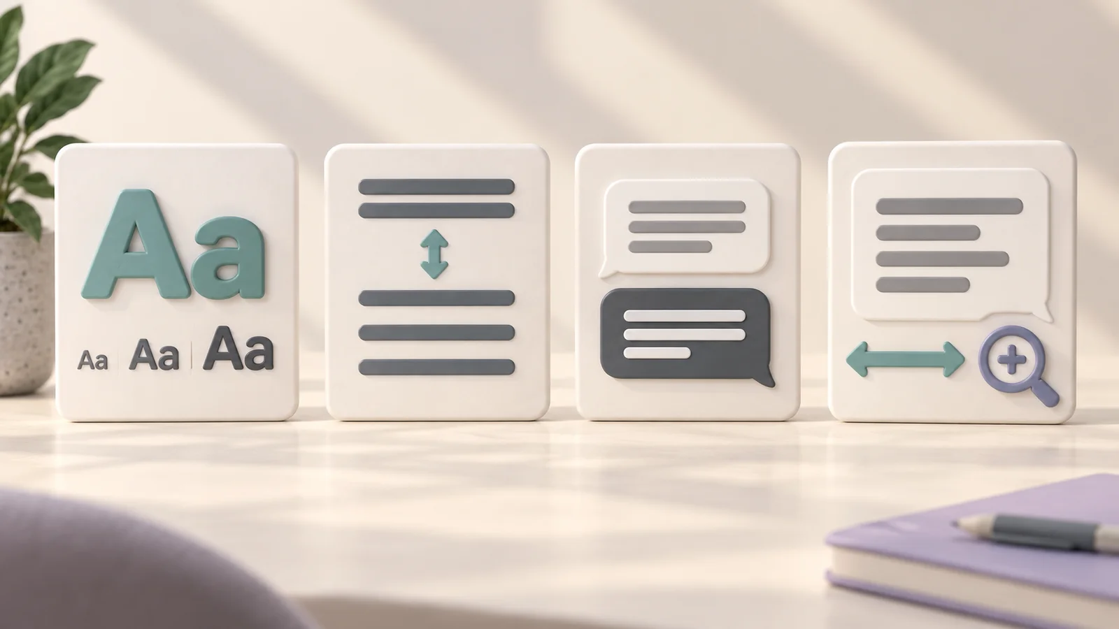
A conceptual quick-start guide to typography, spacing, contrast, and width. These illustrations are not screenshots of StylerGPT's controls.
Set up ChatGPT and StylerGPT before making changes
StylerGPT is a browser extension for the ChatGPT web interface at chatgpt.com. Use the official store links on the download page for Chrome, Edge, or Firefox. The extension's settings apply in the browser where it is installed.
Turn on system accessibility settings first
Start with the browser zoom and operating-system display settings you already use. Larger text, magnification, or a high-contrast mode may give you a better baseline before you fine-tune the conversation's appearance.
Keep any assistive technology you rely on enabled during testing. A visual theme alone does not establish keyboard or screen-reader accessibility.
Open the StylerGPT side panel
Install the extension from your browser's official store, pin its icon if useful, and open ChatGPT. Click the StylerGPT toolbar icon to open its panel. Begin with typography, then compare color and layout changes using the same conversation.
Adjust fonts and spacing for easier reading
Choose readable fonts in StylerGPT
Open Typography, search for a font family, and preview it. StylerGPT includes more than 1,000 Google Fonts. Try Lexend, Atkinson Hyperlegible, or Source Sans 3, and compare them with your default font.
Look at letters and numbers that can be confused: I, l, 1, O, and 0. Test several paragraphs in the language you normally use, not just the font's name in a menu. Apply the font to chat messages if you want to keep the surrounding interface's typography unchanged.
See the default and custom font comparison for a more detailed testing approach.
Set text size, line height, and chat width
StylerGPT's typography size presets pair font size with line height: SM uses 12/20 px, MD 16/24 px, LG 20/34 px, and XL 24/42 px. MD is a useful 16 px baseline; try LG or XL if you need larger text. These are paired presets, rather than a separate numeric line-height slider.
For prose, try a width that produces roughly 45–75 characters per line. A wider layout can be useful for tables or code, while a narrower one may make the next line easier to locate. Adjust the chat layout separately from the font-size preset.
The WCAG text-spacing criterion concerns keeping content usable when a reader overrides spacing. It does not require every page to use a particular default line height.
Font setup comparison for different reading preferences
| Reading preference | Fonts to compare | What to evaluate |
|---|---|---|
| Familiar sans-serif | Default font, Source Sans 3 | Comfortable paragraph reading and interface scanning |
| Distinct letterforms | Lexend, Atkinson Hyperlegible | Whether similar characters are easier for you to distinguish |
| Larger text | Atkinson Hyperlegible or your preferred sans-serif | Legibility at larger sizes and whether content remains visible |
No font works best for everyone with dyslexia or low vision. Compare the same passage and choose based on your own experience rather than the font's label.
Improve contrast, color themes, and page layout
Apply high-contrast themes and readable bubble colors
Open Themes and try an accessibility-oriented preset such as Low Vision Navy. Use it as a starting point, then check the actual text and surfaces you read. A theme name does not guarantee that every customized combination meets accessibility requirements.
WCAG's minimum text contrast guidance generally calls for 4.5:1 for normal text and 3:1 for large text, with stated exceptions. Large text means at least 18 pt regular or 14 pt bold. The separate non-text contrast criterion addresses visual information needed to identify controls and their states, generally at 3:1 against adjacent colors.
Adjust user and assistant bubble colors in Chat Bubbles and check text against each bubble's background. Keep messages distinguishable without relying only on hue. If you change a background image or its visibility, check contrast again where the image is brightest and darkest.
Cut glare and visual clutter with background and layout controls
Try a solid background or reduce wallpaper visibility when an image competes with the words. Keep the layout focused on the conversation and hide optional decorative elements if they distract you. Adjust screen brightness to your surroundings as well.
For long prose, choose a chat width that feels comfortable. For tables and code blocks, verify that horizontal scrolling and controls remain available at your chosen zoom.
Light, dark, and high-contrast themes compared
| Theme type | Potential benefit | What to watch for |
|---|---|---|
| Light | Familiar dark text on a light surface | Excessive brightness in a dim room |
| Dark | Lower overall screen luminance | Thin text, faint controls, or unclear bubble boundaries |
| High contrast | Stronger separation between text and surfaces | Personal comfort and contrast across every customized surface |
There is no universal winner for eye comfort. Compare the options in your usual lighting and keep the one that works for you.
Test your setup and use tools that support accessible reading
Run a quick accessibility check after each change
- Read a conversation with paragraphs, a list, a table, and a code block.
- Try 125% and 150% zoom, then 200%. Look for clipped text, hidden controls, or overlapping content. WCAG's Resize Text criterion addresses resizing text to 200% without losing content or functionality, subject to its exceptions.
- Use Tab and Shift+Tab to move through controls. Check that focus remains visible and you can reach and operate what you need.
- Recheck text and control contrast after changing theme, bubble colors, or background.
- Open an exported file and confirm its text is readable and searchable in your chosen reader.
- Repeat in each browser you actually use. Check the StylerGPT changelog when behavior changes.
This is a practical personal check, not a full accessibility audit. If a customization makes an important control harder to use, revert that setting and compare with the native interface.
Use built-in tools to keep chats portable
The Toolbox can reduce the effort of moving through and reusing conversations. Open Prompt History to reuse earlier prompts, or use Smart Search and Message Navigator to find the part you need. Chat Export saves local copies for reading in another application. YouTube Summarizer can bring an available transcript into your workflow.
| Tool | How it can help | How to use it |
|---|---|---|
| Prompt History | Reduces repetitive typing | Use Ctrl/Cmd + Up/Down in the message box |
| Smart Search | Finds synced chat titles and messages locally | Open Smart Search and search for a distinctive phrase |
| Message Navigator | Reduces manual scrolling within a conversation | Select the message you want to revisit |
| Chat Export | Creates portable copies for another reading application | Use the chat header's Download action and choose PDF, DOCX, Markdown, TXT, or JSON |
| YouTube Summarizer | Makes an available video transcript easier to work with | Open YouTube Summarizer for a supported video |
Availability and allowances depend on your plan. Exporting a file does not itself guarantee that the resulting document is accessible to every assistive technology; check it in your actual reading application.
Keep your setup simple, readable, and easy to adjust
Start with system settings, then adjust typography, contrast, and layout. Test after each change and keep the settings that make a real difference to your reading. Revisit them when your lighting, screen, or needs change.
FAQs
What should I change first for easier reading?
Start with browser zoom or a comfortable text-size preset. Then compare a quiet theme, a readable font, and a suitable chat width. Change one thing at a time so you can identify what helps.
How do I know if my contrast settings are accessible?
Measure the actual foreground and background colors with a contrast checker. Check normal text against the 4.5:1 threshold and large text against 3:1, taking the criterion's exceptions into account. A live preview helps you judge comfort, but does not replace measurement or checks of keyboard access and zoom.
Which font works best for dyslexia or low vision?
There is no single best font. Try fonts with distinct letterforms, such as Lexend or Atkinson Hyperlegible, and compare them with a familiar default using the same passage. Font size, spacing, contrast, and individual preference matter alongside the typeface.
Sources
Official references used to support the product details and factual claims in this article.