
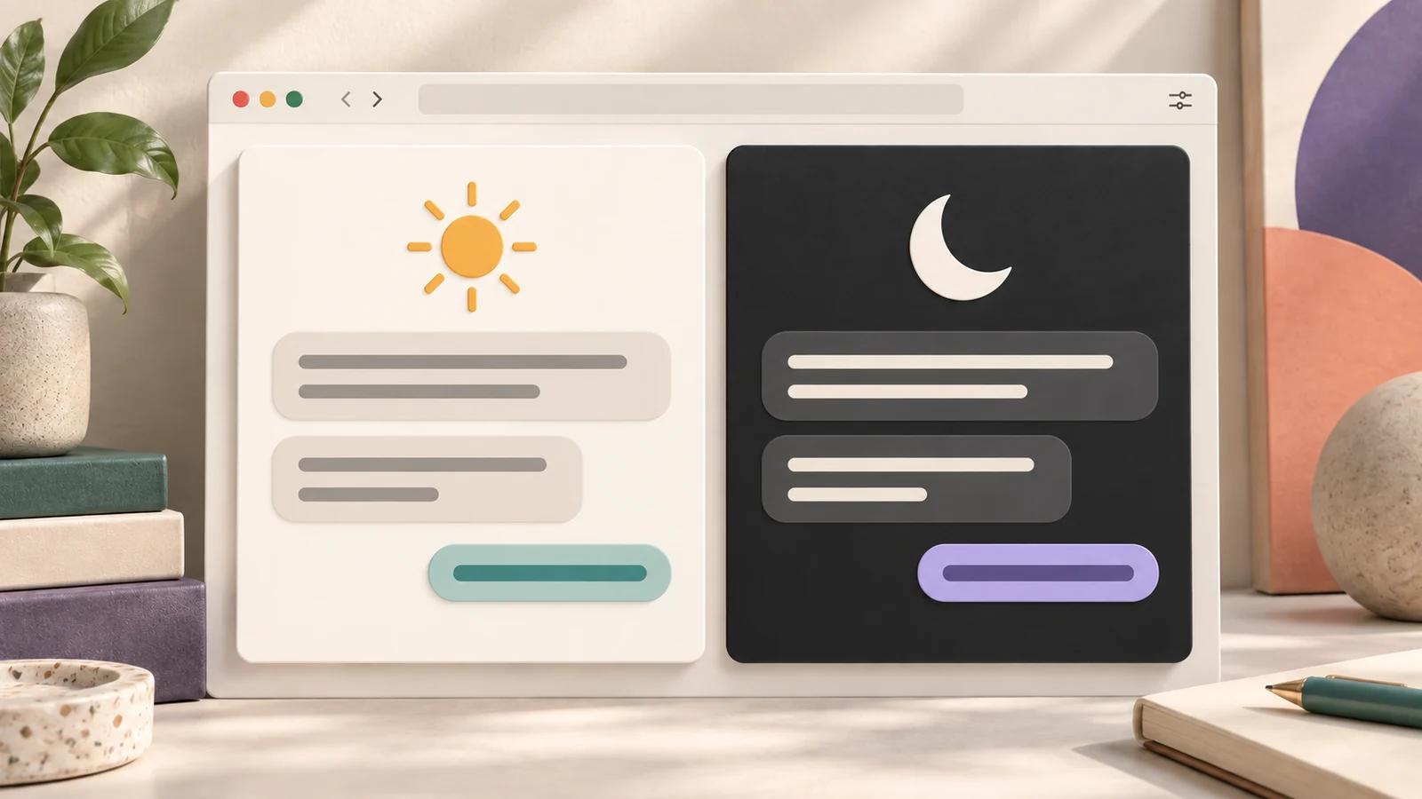
Light vs. Dark Themes: Which Works Better?
If we had to give one short answer, it's this: try light mode for daytime reading and dark mode at night. There's no single best pick for everyone. The right theme depends on room lighting, task type, screen type, contrast, and your own reading comfort.
Here's the short version:
- Light themes can be a useful starting point for reading long AI replies, reviewing tables, and editing in bright rooms.
- Dark themes can feel more comfortable for late-night use, coding, and long sessions in dim spaces.
- Contrast matters more than color alone. WCAG specifies at least 4.5:1 for normal text and 3:1 for large text. Essential visual information in active controls and graphics generally needs 3:1 against adjacent colors.
- OLED and AMOLED screens can use less power to display darker content. Standard LCD screens do not get the same pixel-level saving; actual battery gains depend on the display, brightness, and content.
- Some people find light text on a dark background soft or glowy. Test both modes with text you actually need to read instead of assuming either is universally more accessible.
Pick your theme by task and lighting. A practical starting point is light mode for detail-heavy work during the day, then dark mode in the evening or in a dim room.
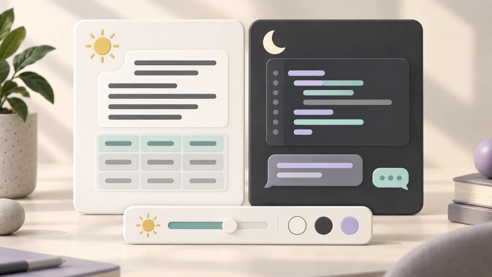
Light and dark setups suit different tasks and lighting conditions. The illustration is conceptual; use the comparisons below to test your own workspace.
Light vs Dark Mode: Everything You Need to Know (as a beginner)
Quick Comparison
| Theme | Best For | Works Best In | Main Upside | Main Drawback |
|---|---|---|---|---|
| Light | Reading, editing, tables, structured AI output | Bright rooms / daylight | Clear dark text on a light surface | Can feel too bright in low light |
| Dark | Coding, research, late-night chats, brainstorming | Dim rooms / evening | Lower perceived brightness | Body text can feel harder to read for some people |
A simple starting point is light by day, dark at night. When testing what feels best, don't stop at the theme alone: font, spacing, chat width, and bubble colors can change the reading experience too.
The core idea is to match your setup to how you work. Keep whichever mode helps you read and navigate comfortably, even when it differs from this starting point.
Light Themes: Readability in Bright Settings and Brightness in Dim Rooms
Light themes use dark text on a light background. In a bright room, that can make the screen feel more consistent with its surroundings. Screen reflections still depend on the display finish, position, and surrounding lights; changing the theme does not remove them.
Readability also depends on font size, line height, word spacing, and line length. If text feels cramped, compare these settings where available before assuming you need a different theme or font. Our guide to default and custom ChatGPT fonts explains how to compare typography.
Where Light Mode Works Best
Try light mode for daytime, detail-heavy tasks: reviewing structured responses, editing drafts, checking citations, and scanning tables.
It can also suit form-like tasks, such as filling in prompts, reviewing numbered steps, and comparing structured outputs. When you need to sort through lots of on-screen detail, test whether a light background makes it easier to follow the content.
Where Light Mode Falls Short
A bright white background in a dim room can feel harsh against its surroundings. Lowering screen brightness or switching to a darker theme may be more comfortable.
Low-contrast light themes can also fail accessibility checks. A theme isn't automatically accessible just because its background is light. Pale text, faint borders, or a busy wallpaper can still make content difficult to distinguish.
Dark Themes: Comfort in Low Light and Mixed Reading Preferences
Dark themes use light text on a dark background, reducing how much of the screen appears bright. In low light, that can feel less harsh. It does not mean every reading task becomes easier or faster: text contrast, size, and individual preferences still matter.
Where Dark Mode Works Best
Try dark mode during late-night work, research sessions, and coding. If you're reading a long thread or working through notes after hours, a darker interface can fit the lighting around you.
On OLED and AMOLED screens, darker pixels can also use less power. Purdue's research on OLED phones shows why brightness and displayed content affect the size of that saving. Don't assume the same battery improvement on every device, particularly a standard backlit LCD.
Where Dark Mode Falls Short
Dark interfaces still need clear text and controls. Muted gray text, low-contrast syntax colors, and barely visible borders can make a dark theme difficult to use.
Some people also find bright text on dark backgrounds less sharp. If letters look soft or have a halo, compare the same paragraph in light mode and adjust brightness and text size. Neither theme is a universal solution for low vision or other accessibility needs.
Matching Theme Choice to Workflow, Accessibility, and Device Type
Pick the theme that fits the task, the room, and the screen in front of you. Reading-heavy work in a bright space is a good opportunity to try light mode. Low-light work is a good opportunity to try dark mode. Your results matter more than a fixed rule.
Here's a quick guide:
| Workflow | Theme to Try | Lighting Condition | Key Accessibility Check | Trade-off |
|---|---|---|---|---|
| Reading long responses | Light | Bright / daylight | 4.5:1 normal text contrast | Can feel too bright when room lighting drops |
| Coding / technical work | Dark | Dim office | Syntax highlighting contrast | Muted colors can be hard to distinguish |
| Data review (tables) | Light | Bright / daylight | Text contrast and clear row structure | Faint borders can obscure grouping |
| Late-night brainstorming | Dark | Low light | Readable text and visible focus states | Some readers notice soft or glowy text |
Accessibility Checks Both Themes Must Pass
Check your actual text and controls, including content over message bubbles and wallpapers:
- Normal text: at least 4.5:1 against its background.
- Large text: at least 3:1. WCAG defines large text as at least 18 point, or 14 point when bold.
- Essential non-text visuals: generally at least 3:1 against adjacent colors for the information needed to identify active controls, states, and graphical objects.
The W3C text contrast guidance and non-text contrast guidance explain the scope and exceptions. Inactive controls are exempt from these minimum contrast requirements; they can still benefit from being recognizable. Check active hover and focus states as well as the default view. Contrast alone does not establish full WCAG conformance.
A Practical Default
Start with light during the day and dark in the evening, then adjust based on your experience. For detail-heavy work like data review or long-form reading, compare both using the same content. In a dim room, try dark mode and a lower screen brightness.
Neither choice has to be fixed. If you switch tasks often, keep the appearance controls easy to reach.
Using StylerGPT to Switch Themes Without Slowing Down Your Workflow
If you change themes based on the time of day or the work you're doing, the switch should be easy. StylerGPT provides appearance controls for ChatGPT's desktop web interface, so you can compare settings while keeping your conversation open.
You can choose an appearance, change backgrounds and fonts, adjust chat width, and customize bubble styling, depending on your plan. Test the result on a real conversation before settling on it.
StylerGPT also includes a Toolbox for productivity settings. Export, search, and prompt history have their own entry points in the interface; they aren't all actions performed inside the appearance panel. See the setup guide for where to find them.
An eligible new installation can activate a 7-day Power trial to explore the theme library and additional tools. After the trial, Free retains color palettes, Pro includes advanced font, background, and layout controls, and complete theme presets require Power. Compare the current plans.
How to Test Light and Dark Setups During Real Work
Test each theme while reading, writing, and working through long chats. A blank screen won't show how a setup handles the content you use most.
- Open a conversation with a long reply, a table, and a code block if you use code.
- Compare light and dark appearance at a comfortable screen brightness.
- Check body text, links, table rows, code colors, and active controls.
- Adjust one setting at a time: font size, chat width, bubble colors, or background.
- Repeat in your usual daytime and evening lighting.
Don't stop with the base theme. A wider layout may help a cramped table, while shorter lines may feel better for long paragraphs. Choose a width that fits the task rather than making every conversation as wide as possible.
FAQs
Should I Switch Themes Automatically by Time of Day?
A schedule can be convenient if your operating system supports it and your appearance follows the device setting. StylerGPT offers device-based appearance, but it does not provide a separate time-of-day light/dark scheduler.
Background Roulette is a different feature: it rotates background images manually or daily, weekly, or monthly with Power or an active trial. Rotating a wallpaper is not the same as switching the interface between light and dark. Read more in the FAQ.
Why Does Dark Mode Look Blurry for Some People?
Some readers perceive light text on a dark background as soft or surrounded by a halo. The effect can vary with the display, brightness, text size, and individual vision. It is not a reason to assume everyone should avoid dark mode.
Compare the same text in both themes. Try a larger font, comfortable brightness, and clear text/background contrast. StylerGPT's appearance and typography controls let you test different setups, but they do not guarantee that one mode will be more comfortable for every reader.
What Settings Matter Besides Light or Dark Mode?
Font family, font size, spacing, and line length all affect how text reads. Check the spacing controls available in your environment, and avoid assuming that changing the font alone will fix cramped content.
You can also adjust chat width, bubble colors, backgrounds, and code block styling with the relevant StylerGPT controls and plan. Keep backgrounds quiet behind text and check the result with a real conversation. Browse ChatGPT themes or follow our ten customization tips to build a setup that suits your work.
Sources
Official references used to support the product details and factual claims in this article.